by Vincent Rubinetti
Frontend Developer, UX/UI Designer
Created October 25, 2019
Updated November 6, 2019
This is an introduction to the Scalable Vector Graphics image format. It is aimed at people in academia and and how they might most commonly use the format (for figures, papers, presentations, posters, etc).
This tutorial should teach you:
- What SVG is, how it works, and why it is useful
- The basic building blocks of the SVG format
- How to make basic SVGs by hand
- How to more confidently edit SVGs generated by software
- When it is appropriate to make an SVG by hand and when it is not
- General familiarity with the format such that you can more effectively Google a particular problem
Table of contents
Background
Raster vs vector
What is a vector image, and how does it differ from a regular image?
In short: A raster image is made up of a grid of pixels, whereas a vector image is made up of shape definitions. Essentially, it is a set of instructions on what to draw, rather than a long list of pixels.


Benefits of vector graphics
A vector graphic can be scaled to any size with perfect clarity and definition. Internally, when a program displays a vector graphic, it calculates the shapes and “renders” them to a grid of pixels with the same resolution as your monitor. This way you always get a smooth, crisp result.
A raster graphic can be scaled to any size too, but requires some sort of algorithm to interpolate what should go in between the original pixels, which usually produces poor, blurry results.

In addition, vector graphics usually have a smaller file size than raster graphics, because they are defined by a few lines of text that describe shapes, rather than many rows and columns of individual pixels.
What’s an example of vector graphics that almost everyone has used?
Answer: Fonts. Most fonts are vector based so text can be scaled to any size.
Limitations of vector graphics
Because vector graphics are drawn with shapes, they are better suited to simpler, less detailed, more “geometric” images. More “photographic” images, such as realistic depictions of people, animals, etc, are usually better captured by raster images.


What is SVG
SVG is the most popular general-purpose vector graphic format. It was developed by the W3C, the organization in charge of defining web standards like HTML and CSS.
SVG was originally aimed at the web, but it became so popular that you now see it in a lot of other contexts too, like Word documents, PDFs, graphs, illustrations, graphic design, printed media, etc. Keep this in mind when using SVGs outside of a browser: the context you’re using it in might not support all of the advanced features that a browser does, because it has essentially co-opted the technology from another platform.
Basics
How SVGs are written
SVGs are just plain text files that contain descriptions of what shapes to draw. You can create or edit them in any text editor. You can also use software like Inkscape or Adobe Illustrator to make more complex SVGs, but they are still saved and represented as plain text.
SVGs are written in a simple markup language called XML that consists of three main concepts:
- Elements - the individual components or building blocks of your image
- Element attributes - the properties attached to an element that describes its appearance, behavior, etc
- Element hierarchy - the organizational structure of the document, formed by arranging elements in an order or nesting them within one another
<element attribute="value">
  <child attribute="value">
    ...more content...
  </child>
  <child attribute="value" />
</element>
<!-- comment -->
Element with children elements inside:
<element><child>...</child></element>
Element with attribute:
<element attribute="value">...</element>
Self-closing/empty element:
<element attribute="value" />
Note: XML is generally whitespace-insensitive, so you’ll see slightly different ways to format the code throughout this tutorial and in online examples.
Coordinate system
An SVG has an abstract coordinate system with arbitrary units called “SVG units” or “user units”. It is a regular Cartesian coordinate space – except that positive is down and to the right – that eventually gets mapped to some real world space.
<element
  some-coordinate="-100"
  some-dimension="34.5"
>

Unless specified otherwise, the coordinates/dimensions/etc of everything are given in SVG units, as plain numerical values.
The <svg> element
In every SVG, there is a top level <svg> element that contains all of the contents of the image and some key properties of the image. There are only 4 attributes you will likely ever use in this element: xmlns, viewBox, width, and height.
<svg
  xmlns="http://www.w3.org/2000/svg"
  viewBox="..."
  width="..."
  height="..."
>
  ...
</svg>
In SVGs generated by software, you will often see many other attributes and elements at or near the top-level of the document. Many of these are unnecessary, or only necessary in very specific contexts. Most likely, they are there either to support legacy browsers or older versions of SVG. When in doubt, just remove a line and see if it still works.
The xmlns attribute
The xmlns attribute is a namespace that simply tells the viewing software that the XML document is meant to be parsed as an SVG.
It is always required, except in the rare case that you are including an SVG directly (inline) in an HTML document.
There are also some advanced SVG features that require providing additional namespaces.
The viewBox attribute
The viewbox is the window into the SVG’s coordinate space, and defines the boundaries of the image.
You can think of it like a camera or a frame, or as the cropped area of the scene.
You specify the x/y coordinate of the upper left corner and the width/height of the viewbox, in SVG units.
<svg
  viewBox="x y width height"
  viewBox="70 60 100 75"
>

viewBox should always be specified; weird things can happen if it isn’t.
Width and height
The width and height attributes indicate how wide and high the viewbox (the image) should appear – in real world size – in its final context.
They are the only SVG attributes that should have a specified unit.
If no unit is specified, they are interpreted as pixels.
<svg
  width="..." height="..."
  width="4in" height="3in"
>

Along with viewBox, these attributes essentially define a mapping from SVG units to real world units.
If these attributes are omitted entirely, the image will usually be scaled to fit the dimensions of its container, depending on the software. If you specify only one of these attributes, the other dimension will scale proportionally (preserving aspect ratio).
In practice, it is often more useful to not hard-code these attributes into the SVG, and to simply scale the image in situ to the needed size (eg, in CSS for a webpage, or in Inkscape before rendering as a PNG).
As such, the minimum/boilerplate code to form a valid SVG is an <svg> element with the xmlns and viewBox attributes.
Overflow
The “overflow” of an SVG is the content of the scene that extends beyond the boundaries of the viewBox.
By default, the overflow attribute on the <svg> element is set to visible.
This can be confusing, since we previously said that the viewBox defines the boundaries of an image; and is it really a boundary if things can go past it?
Most SVG editing software will treat the viewBox as a hard boundary, in that when you render it to a raster image (eg .jpg), it will chop off the overflow.
But while editing, it may still show the overflow, along with some lines to indicate where the viewBox is.
A web browser, though, will always show the overflow, unless you change the overflow attribute, or your window is the same aspect ratio as your viewBox (since browsers typically fit to contain rather than fit to cover).
Units
It is actually possible to specify coordinates/dimensions/etc in terms of “real world units” like inches, but it is typically not advisable.
"1px"  →  "1"
"1in"  →  "96"
"1cm"  →  "37.795"
"1pt"  →  "1.333"

Any time a real world unit is written, it first gets converted to SVG units based on constants defined in the SVG standard.
Then, the element is positioned and scaled within (relative to) the viewBox you specified.
Then, the viewBox is sized by the viewing software to make the image appear the real world width and height you specified, (hopefully) taking into consideration your monitor’s resolution/dpi.
Because of this pipeline, specifying real world units is prone to error. You might not produce the actual size you intend.
Bottom line: Write SVGs without units, except for the width and height attributes on the <svg> element itself.
It is standard practice; and most SVG editing software seems to generate SVGs in this manner by default.
It is also in line with the main purpose of SVGs, which is to create images that are independent of actual size.
Units example
<svg
  viewBox="0 0 96 96"
  width="4in"
  height="4in"
>
  ...a square with width and height set to "0.5in", centered in the viewbox
</svg>
Consider the above example.
Assuming the software that views the SVG does a good job, what should the final real world size of the square be?
Answer: 2in x 2in
Stroke and fill
Before getting into drawing basic shapes, it is necessary to understand the stroke and fill attributes.
The stroke is the outline of a shape, and the fill is the area within a shape.
Both attributes can be set to a color, or to none to be disabled.
<element
  fill="..."     stroke="..."
  fill="skyblue" stroke="blue"
>

By default, SVG shapes have fill="black" and stroke="none"; even shapes that are intended to be just strokes, like lines.
You will likely have to override this frequently.
By default, the stroke is shown in front of the fill.
Unfortunately, there is no reliable way to switch this order.
Special note: You may also come across the value currentColor.
This makes the fill or stroke match the “active” color in whatever is viewing the SVG.
This is really only relevant in web development, where, for example, you may want an SVG icon to automatically match the color of the text it is inline with.
If there is no “current color” to use, it will default to black.
Color
Color theory is a complex topic that merits its own independent study. But for the purposes of being able to dive right into creating images, here is a brief explanation.
There are several ways to specify colors in SVG:
| Method | Normal (opaque) | With transparency |
|---|---|---|
| Named | red |
- |
| Hex | #ff0000 |
#ff0000aa |
| Hex shorthand | #f00 |
#f00a |
| Red, Green, Blue | rgb(255, 0, 0) |
rgba(255, 0, 0, 0.66) |
| Hue, Saturation, Luminance | hsl(0, 0%, 100%) |
hsla(0, 0%, 100%, 0.66) |
HSL splits colors into: hue – what color it is (red vs green vs purple), saturation – how much color there is (black/white vs colorful), and luminance – how bright it is (dark vs light).
RGB splits colors into red/green/blue components, between 0 and 255 (256 possible values). Balance the components in different proportions to get different hues. Increase/decrease all of the components to increase/decrease the brightness. All 0’s = black, all 255’s = white.
Hex is just a more compact way to write RGB. The 0 to 255 range is compressed down to 2 hex digits, each with 16 possible values (0, 1, 2, 3, 4, 5, 6, 7, 8, 9, A, B, C, D, E, F). The first two digits represent red, the next two green, and the next two blue.
Hex colors are the most common way to write colors in web technologies.
Hex shorthand is a more compact way to write a hex color, where each digit is simply duplicated to create a full hex color.
Named colors are just regular (English) color names, like red or violet.
Non-named colors can also accept an additional alpha (a) parameter at the end, which will blend it with whatever content is behind it.

Material design color palette
Another nice color palette
AI-generated color palettes
Nice pairs of colors for gradients
Opacity
An element’s opacity defines how much it will blend in with whatever content is behind it, on a scale of 0 to 1. An opacity of 1 will make an element completely opaque; 0 completely invisible; 0.5 half-way translucent.
<element
  opacity="..."
  opacity="0.5"
>

There are also fill-opacity and stroke-opacity attributes to set the transparency of the fill and stroke separately, but they are not broadly supported yet.
Z-order
Elements are stacked in the order they appear in your SVG document. Later defined elements are stacked on-top/in-front of earlier defined elements.
<!-- 1 -->
<rect />
<!-- 2 -->
<rect />
<!-- 3 -->
<rect />

Basic Shapes
Rectangle
<rect
  x="..."
  y="..."
  width="..."
  height="..."
/>

A rectangle is written in the same way as the viewBox attribute: by specifying the x/y coordinate of the upper left corner of the box and the width/height of the box.
Rounded rectangle
<rect
  x="..."
  y="..."
  width="..."
  height="..."
  rx="..."
  ry="..."
/>

A rounded rectangle is written the same way as a regular rectangle, but with the added rx and ry attributes that specify the corner radius.
The width and height attributes still refer to the full outer width and height of the shape.
Circle
<circle
  cx="..."
  cy="..."
  r="..."
/>

A circle is written by specifying the x/y coordinate of the circle center, and its radius (r).
Ellipse
<ellipse
  cx="..."
  cy="..."
  ry="..."
  rx="..."
/>

An ellipse is written the same way as a circle, but with separate rx and ry attributes for the x-axis and y-axis radii.
Line
<line
  x1="..."
  y1="..."
  x2="..."
  y2="..."
/>

A line is written by specifying start and end x/y coordinates.
Polygon / polyline
<polygon
  points="... x y x y ..."
/>
<polyline
  points="... x y x y ..."
/>

A <polygon> element is intended for closed shapes, where the last point is automatically connected to the first.
A <polyline> element is intended for multi-segment lines (open shapes), and is not automatically closed.
The points attribute is written as a series of x/y coordinates, separated by space or comma.
Note that if fill is specified for an open shape, it will still be filled and essentially look as if it has been closed, except the last stroke segment will be missing.
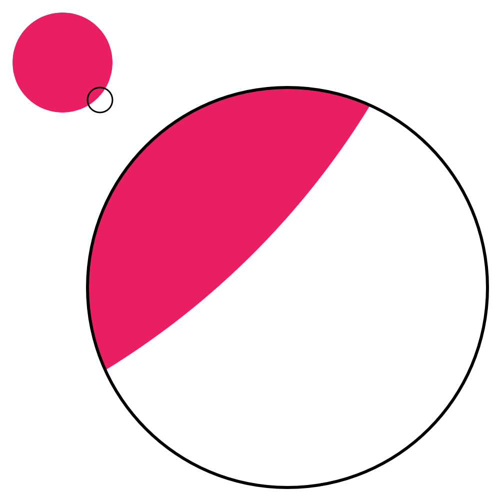
EXERCISE 1

Recreate this SVG using the techniques covered so far. The exact colors, lengths, and dimensions are not important; just try to capture the basic picture.
Strokes
Width
The stroke-width attribute specifies the thickness of the stroke around an element.
Note that the stroke is always applied “on center” with the outline of the element.
Half of the stroke width will be applied on one side of the outline, and the other half on the other side.
The outline is exactly where you specify it in the geometry of your shape.
<element
  stroke-width="..."
/>

Unfortunately, there is no reliable way to set the stroke to be on the inside or the outside of the outline. You will either have to adjust your geometry points to account for the thickness you want, or use a program like Inkscape or Illustrator to help you achieve the desired effect.
Line cap
The stroke-linecap attribute specifies how the strokes of unclosed shapes look at their ends.
<element
  stroke-linecap="butt"
  stroke-linecap="square"
  stroke-linecap="round"
/>

Butt is the default; it specifies that the stroke ends flush with the end of the outline.
Square specifies that that stroke extends beyond the end of the outline a distance of half the stroke thickness, creating the appearance of a square centered on the end point.
Round is the same as square, except the the stroke is rounded creating the appearance of a circle centered on the end point.
Line join
The stroke-linejoin attribute specifies how consecutive segments of a stroke are joined.
<element
  stroke-linejoin="miter"
  stroke-linejoin="bevel"
  stroke-linejoin="round"
/>

Miter is the default; it extends the edges of the stroke until they intersect, and fills the enclosed area.
Bevel treats the segments as if they were butt caps, and fills the resulting gap between them.
Round treats the segments as if they were round caps.
The stroke-miterlimit attribute can be used to make a miter join by default, but make a bevel join where the joint angle is too sharp (to avoid a long point jutting out).
Dashed lines
The stroke-dasharray attribute allows you to create custom dash patterns for strokes.
The attribute is specified as a series of alternating dash and gap lengths, starting with the first dash length.
<element
  stroke-dasharray="d g d g ..."

  stroke-dasharray="10"
  stroke-dasharray="20 10"
  stroke-dasharray="20 10 5 10"
/>

If you only provide one value, the dash and gap values will be the same. In reality, when an odd number of values is provided, the sequence is duplicated once to yield an even number; but this results in unintuitive behavior, and is not recommended for best clarity.
Note: The units of the dash and gap lengths are the same as any other unit in SVG. They are absolute distances, not percents or any other relative measurement.
Dotted lines
By setting stroke-linecap to round or square and using 0-length dashes, you can create dotted lines.
<element
  stroke-dasharray="0 15"
  stroke-dasharray="0 15 10 15"
  stroke-dasharray="0 15 10 15"
/>

Dash offset
By default, the dash pattern begins at the starting point of the stroke.
The stroke-dashoffset attribute shifts the dash pattern toward the end point (negative) or toward the start point (positive).
<element
  stroke-dashoffset="0"
  stroke-dashoffset="-5"
  stroke-dashoffset="-10"
/>

EXERCISE 2

Recreate this SVG using the techniques covered so far. The exact colors, lengths, and dimensions are not important; just try to capture the basic picture.
Text
The <text> element
Unfortunately, text is one of the most painful things to deal with in SVG. It will display inconsistently on different platforms and software, especially with regard to alignment.
To guarantee it will always look as expected, convert text to raw shapes using SVG software (eg Inkscape’s “Object to path” functionality).
When you do this, it is a good idea to either leave in the original <text> element commented out, or just make a comment noting the font/size/style you used to generate the text, for posterity.
<text
  x="..."
  y="..."
>
  Text
</text>

Text is written by specifying an x/y coordinate on a <text> element, and enclosing the actual text to be displayed within the element.
Styling
There are many properties available for styling text, but here are the most useful/common ones.
<text
  font-family="Montserrat"
  font-size="16"
  font-weight="bold"
  font-style="italic"
  text-decoration="underline"
  letter-spacing="5"
>
  SPOOKY
</text>

The font-weight attribute can be set to normal (default), bold, bolder, lighter, or a multiple of 100 between 100 and 1000 (400 is normal, 700 is bold).
If the specified font family isn’t installed, a system default will be used.
Special note: It is possible to specify an order of fallback fonts, including a generic type (eg serif, sans-serif, monospace).
You most likely won’t need to use this, but keep it in mind.
Horizontal alignment
The text-anchor attribute determines how the text is aligned horizontally.
The default is start.
<text
  text-anchor="start"
  text-anchor="middle"
  text-anchor="end"
>

Vertical alignment
The dominant-baseline attribute determines how the text is aligned vertically.
The default is baseline.
<text
  dominant-baseline="baseline"
  dominant-baseline="middle"
  dominant-baseline="hanging"
>

Don’t confuse this with the alignment-baseline attribute, which is similar but not quite the same.
The <tspan> element
<text>
  grumpy
  <tspan fill="#e91e63">
    cat
  </tspan>
</text>

<tspan> elements can be placed inside <text> elements to style individual words/strings without breaking the normal flow of text.
<tspan> offset
<text
  baseline-shift="super"
  baseline-shift="sub"

  dx="..."
  dy="..."
>

<tspan> elements can be positioned normally with x and y, but can also be positioned relative to the preceding text using the dx and dy attributes.
Note that using these attributes offsets all of the following text as well as the element it is applied to.
You can think of it as moving a typing cursor; once you move it, the next text that comes in will start at that position.
The baseline-shift attribute can be used to quickly create a superscript or subscript without affecting the text after it.
em can be used as a font size unit to specify a size relative to the current font size.
For example, you may want to set font-size="0.75em" on a superscript element to make it 75% the size of the normal text.
Unfortunately, there is no reliable way to auto-wrap text in SVG. You will have to manually break text at the desired places and position lines beneath one another.
Whitespace
As mentioned before, SVG (and most of the related web standards) are whitespace-insensitive. Multiple consecutive whitespace characters are collapsed down to one. This can unfortunately cause some tricky problems with text, because the way you format your code sometimes matters.
grumpy<tspan>cat</tspan>

grumpy
<tspan>
  cat
</tspan>

Keep this quirk in mind when writing text in SVG. If you are having alignment/spacing problems, check your whitespace.
If you explicitly need multiple consecutive whitespace characters in your text, you can force them with Unicode characters (eg   for a single space).
EXERCISE 3

Recreate this SVG using the techniques covered so far. The exact colors, lengths, and dimensions are not important; just try to capture the basic picture.
Paths
The <path> element
A <path> element can be used to create arbitrary shapes that behave like any of the standard shapes (with regard to fill, stroke, opacity, etc).
The geometry of a path is specified in its d (data/description/definition) attribute.
<path
  d="..."
  fill="..."
  stroke="..."
/>

The d attribute
The d attribute takes a sequence of draw commands.
You can think of these commands as moving a paint brush around a canvas.
Commands go from the current point – wherever the “brush” ended up from the previous commands – to the specified point.
Each command is a single letter, and can be followed by numerical values to specify where and how to draw the command.
M 50 50 L 100 100 C 75 100, 50 75, 50 50

M 50,50 L 100,100 C 75,100 50,75 50,50

M 50 50
L 100 100
C 75 100 50 75 50 50
The syntax of these commands is similar to that of the points attribute for polygons and polylines. Values can be separated by spaces or commas. Letters next to numerical values do not need to be separated at all, because they can be differentiated by the parser just by their type (whereas “10,10” can’t be condensed to “1010” without looking like one thousand and ten). Line breaks are also permitted.
There are many different ways to format path strings. However, for best clarity, it is recommended to separate commands by line, and separate command values by space.
Move to
The M command moves the brush to the specified point without drawing anything between.
M x y

You will always start a path by specifying a “move to” point, so the brush has somewhere to start.
Line to
The L command draws a straight line from the previous point to the specified point.
The H and V commands draw horizontal and vertical lines, respectively, from the previous point to the specified x or y coordinate.
L x y

H x
V y

Close
The Z command closes the current shape, drawing a line back to the first point.
M 25 25
L 45 45
M 55 55
L 75 75
L 45 80
Z

Because of the “move to” command, it is possible to draw multiple shapes in the same path element, called “subpaths”.
The Z command closes the current subpath.
Arc to
The A command draws an elliptical arc from the current point to the specified point.
A rx ry angle large cw x y

A 50 50 0 0 1 65 75

You might expect that arcs would work by specifying the center point and start/end angles. Instead, it works from start point to end point, and you choose 1 of 4 possible arcs between them. This unfortunately means that if the start/end angles you want to draw aren’t multiples of 90 degrees, you’ll have to do some trigonometry to calculate coordinates, and you’ll end up with a lot of non-whole numbers.
The final x/y inputs are the end point coordinate.

The rx and ry inputs specify the x and y radii of the ellipse that forms the arc.
The angle input determines the direction the rx and ry radii.
It does not change the start/end points of the arc.
The angle specifies the clockwise degrees between the viewBox positive x axis and the positive x axis of the ellipse.
If rx and ry are the same, the angle will have no visible effect, because a perfect circle looks the same when rotated.

Given a certain radius, there are 4 possible arcs that can be drawn between two points.
The large and cw (often called the “large arc” and “sweep” flags) inputs allow you to specify which of the 4 possible arcs should be used.
These inputs should be set to 0 (for false) or 1 (for true).
When large is set to 1, the outer/larger arc is used (shown as dotted lines above).
When large is set to 0, the inner/smaller arc is used (shown as solid lines above).
When cw is set to 1, the clockwise arc is used (shown as blue above).
When cw is set to 0, the counter-clockwise arc used (shown as red above).
Imagine driving a car on the arc from the start point to the end point.
If you have turn right the whole time, the cw flag is 1.
If you have to turn left the whole time, the cw flag is 0.
If the radii you’ve specified aren’t large enough to create an arc to the specified point, they are increased (maintaining proportions) until they are.
Interactive demonstration of the arc command
Curve to
The C command draws a curve with two control (handle) points from the current point to the specified point.
If you’ve ever tried to draw a curve in a program like Inkscape or Illustrator, you are probably familiar with the “handles” on each point.
The best way to understand how control points behave and form curves is to just play around with them in one of those programs.
C a b c d x y

Tip: To connect two curved segments smoothly without any visible joint, make sure that their connecting handle lines are the same slope.
Wikipedia article on Bezier Curves
Interactive demonstration of Bezier curves
Curve to shorthand
The S command is a quicker way to draw a series of bezier curves in succession.
The command essentially does the same thing as the C command, except that the a b control point is assumed to be a reflection of the c d control point of the previous curve.
S c d x y

This command should only be used right after a Q command or another S command; otherwise there is no previous control point to assume from.
This is how the curve/pen tool in programs like Inkscape and Illustrator typically works, where you click and drag to simultaneously define the first control point of the next curve and the second control point of the previous curve.
Quadratic to
The Q command draws a curve with one control (handle) point from the current point to the specified point.
You can think of it as a simplified version of the C command, where both control points are the same.
Q i j x y

Quadratic to shorthand
The T command is a quicker way to draw a series of quadratic curves in succession.
The command essentially does the same thing as the Q command, except that the i j control point is assumed to be a reflection of the i j control point of the previous curve.
T x y

This command should only be used right after a Q command or another T command; otherwise there is no previous control point to assume from.
Relative coordinates
Note that all of the previous commands were shown as capital letters. If you provide a lowercase command letter, coordinates you give it are assumed to be relative to the previous coordinate, instead of relative to the origin of the image (absolute).
M 25 25
h 50
v 30
l -25 25
l -25 -25
z

This can be very useful when you know the difference between each point better than their absolute positions in the overall image. However, if you will want to tweak individual points without affecting all the following points, you should write your coordinates as absolute.
Quirks
If you provide more inputs than are needed for a command, the extra inputs overflow into a new command of the same type. For example, if you write a “line to” command, and keep providing pairs of coordinates without a new command letter, it will simply be parsed as multiple consecutive line commands.
If you are trying to draw a circle in a path element, you unfortunately cannot draw it with only one arc command; you must split it up into multiple. It’s usually the clearest and simplest to just draw two semi-circles.
M 10 10
l 35 0
0 35
-35 0
z

M 70 50
a 20 20 0 0 1 0 40
a 20 20 0 0 1 0 -40
z

EXERCISE 4

Recreate this SVG using the techniques covered so far. The exact colors, lengths, and dimensions are not important; just try to capture the basic picture.
Groups and Transforms
The <g> element
Elements can be grouped together and then treated and operated on as a whole, just like in any software that has grouping.
Placing elements inside a <g> element groups them together.
Groups can be nested within each other, allowing for a complex hierarchy of visual components.
<g fill="skyblue" stroke="blue">
  <rect />
  <polygon />
  <circle />
</g>

Style attributes like fill and stroke can be set once, on the group element, and will automatically cascade down to all of the children elements.
Transformations can be applied to a group to affect all of the children as if they were a single cohesive element.
SVG editing software usually uses groups as a way to make layers that can be conveniently toggled on/off. Groups may also be used to just divide the document into more readable/manageable sections.
Group opacity
When the opacity attribute is applied to a group, all of its children are drawn as normal before the opacity is applied.
If you draw several overlapping shapes with solid fills and put them in a group with an opacity, they will become translucent together as a single shape, rather than being individually translucent.
<rect opacity="0.5" />
<circle opacity="0.5" />

<g opacity="0.5">
  <rect /><circle />
</g>

This is a useful trick when the shape you need is more easily drawn with basic shapes than with a multi-part <path> element, and you need it to be transparent.
The transform attribute
The transform attribute can be applied to an element to translate, scale, rotate, or skew it.
The transformations are applied near the end of the rendering process, meaning that they will transform the element “as is”.
That is, all strokes, fill patterns, child shapes, etc will be warped.
<element
  transform="last() middle() first()"
/>

The attribute takes a series of functions that are applied right to left, separated by space. Multiple functions of the same type can be specified, and in any order. Arguments can be separated by space or comma.
Translate
The translate function takes dx and dy distances (specified the same way as any other unit) to move the object by in the x and y axes.
translate(dx,dy)

Scale
The scale function takes sx and sy factors to scale the object by in the x and y axes.
1 is original size, 0.5 is half size, 2 is double size, etc.
scale(sx,sy)

If sy is not provided, it is assumed to be the same as the provided sx; ie, an aspect-ratio-preserving scale.
Rotate
The rotate function takes an angle to rotate the object by (clockwise, from the positive x axis).
rotate(angle,x,y)

The function also takes an optional x and y rotation pivot point, which is assumed to be the origin if not provided.
Skew
The skewX and skewY functions take an angle to horizontally and vertically (respectively) skew the object by.
Skewing can be thought of as slicing the object (horizontally with skewX or vertically with skewY) and splaying those slices out like a deck of cards.
skewX(angle)
skewY(angle)

The x skew can also be visualized as rotating the vertical axis (counter-clockwise) by an angle, and the y skew as rotating the horizontal axis (clockwise).
Transform origin
By default, transform operations are done relative to the origin of the SVG.
If you wish to transform an element around its center, you unfortunately must go through a tedious process: first translate the object such that its center is at 0,0, apply your rotation/scale/skew, then translate it back to its original position.
There is a transform-origin attribute that can change which absolute point the element is transformed around, but unfortunately it is not reliable.
Also, it only allows you to set the transform origin relative to the viewBox (eg, center of the view), not around the center of a particular element.

As such, sometimes it is a good idea to simply draw shapes around the origin from the start, then translate them to the desired location. This has the added benefit of making the coordinates more symmetric, easier to read, and quicker to change later.
EXERCISE 5

Recreate this SVG using the techniques covered so far. The exact colors, lengths, and dimensions are not important; just try to capture the basic picture.
Special Concepts
Classes and id’s
The id and class attributes can be used to name/label elements so you can refer to them elsewhere in the document.
There is a wide range of valid syntaxes for these names, but it is convention to only use letters, numbers, underscores, or dashes.
Notably, the names cannot start with a number.
<element id="unique_thing" />

<element class="generic_type" />
<element class="generic_type" />
<element class="generic_type another_type" />
An id is meant to reference a specific instance of an object; an object that is unique, and only appears once in the document.
A class is meant to reference a type of object that there are multiple instances of throughout the document.
You can also apply several classes to a single object by separating the class names by space.
You will see SVG editing software output a lot of generated ids and classes. They normally not very descriptive or useful, and can often be removed.
CSS and the <style> element
Recall that SVG is defined by the same people who define web standards like HTML and CSS. As such, there is a lot of crossover and overlap between the standards, making it very confusing for people trying to learn them.
<style>
  element {
    attribute: value;
  }
  #id_name {
  }
  .class_name {
  }
</style>
Adding a <style> element to an SVG allows you to apply CSS styles to certain elements in the image.
A CSS style, for the purposes of SVG, is an alternative way to set an attribute.
Many of the attributes that have been covered in this tutorial so far can also be applied as a CSS style, with a slightly different syntax, as illustrated above.
The benefit of this approach is that you can apply properties to multiple elements in just one spot.
The special characters that precede the names are known as “CSS selectors”.
There are many more advanced selectors, but you will likely only ever use the id # and class . selectors.
Without a preceding character, you are referring to the type of element itself; ie the “element name”.
For example, text { fill: red } would apply a red fill to all <text> elements in the document, whether they have ids/classes or not.
Note that the <style> element itself is not visible; it is a definition element.
There are several other types of definition elements like this as well.
Valid <style> attributes, and exceptions
The attributes that can be applied with CSS styles are referred to as “presentation attributes”. In general, they are the properties that describe the “style” of elements, but not their geometry. The attributes covered in this tutorial that can be applied with styles are:
fill stroke opacity stroke-width stroke-linecap stroke-linejoin stroke-dasharray stroke-dashoffset font-family font-size font-weight font-style text-decoration letter-spacing text-anchor dominant-baseline baseline-shift transform
<style>
  #some_element {
    fill: red;
    stroke: blue;
    stroke-width: 10;

    ...

    transform: translate(10px,5px) rotate(45deg) skewX(10deg);
    font-size: 12pt;
    letter-spacing: 2px;
  }
</style>
Note some small differences: the transform attribute requires specifying units, and requires a comma between function parameters (a space is not valid). The font-size and letter-spacing attributes also require units. In general, if something is not working, check to see if the CSS version of the attribute requires a different syntax than the SVG version.
CSS also has significantly more transform functions than SVG, like perspective and rotate3d.
But use these in SVG with extreme caution; they are not likely to be supported in many programs.
Inline styles
To add more confusion, CSS styles can also be defined “inline”, right on the element, in a style attribute.
This makes 3 ways you can specify the appearance of objects:
- Attributes on the object
- CSS styles in
<style>element - Inline CSS styles
<element attribute="value" />

<style>
  #some_element {
    attribute: value;
  }
</style>

<element style="attribute: value; attribute: value; attribute: value" />
For most purposes, these will all yield the same result. The main difference is that they have different priorities when there are overlapping/conflicting properties for a particular element.
There is no consensus about which of these to use and when. SVG editing software will often prefer inline CSS styles, perhaps because they have the highest/final priority.
<style> example
Here is an example of using a combination of CSS selectors: element name, id name, and class name.
<style>
  text { font-family: Pacifico; }
  #company { font-size: 20pt; }
  .blue { fill: blue; }
  .dot { opacity: 0.5; }
</style>

<text id="company" class="blue">
  Twiddr
</text>
<circle class="blue dot" />
<circle class="blue dot" />
<circle class="blue dot" />

Special note: If you want to use an online font but don’t want to install it on your system, you can dynamically import the font from a url like this:
<style>
  @import url('https://fonts.googleapis.com/css?family=Pacifico');

  #some_element {
    font-family: Pacifico
  }
</style>
Gradients
The <defs> element, like the <style> element, is used to define special things that aren’t shown in the image but can be referenced elsewhere in the document.
Gradients are one such thing.
<defs>
  <linearGradient
    id="rainbow"
    x1="0%"
    y1="100%"
    x2="100%"
    y2="0%"
  >
    <stop
      offset="0%"
      stop-color="red"
    />
    ...
    <stop
      offset="50%"
      stop-color="blue"
    />
    ...
    <stop
      offset="100%"
      stop-color="orange"
    />
  </linearGradient>
</defs>

<rect fill="url('#rainbow')" />

Gradients can be used as fill’s or stroke’s instead of a solid color.
There are two kinds of gradients you can specify: <linearGradient> and <radialGradient> (unfortunately there is no angular gradient).
You can specify the start (x1/y1) and stop (x2/y2) position of the gradient in terms of % (relative to the dimensions of whatever object it is applied to).
You can add any color “stops” that you need, specifying their % through the gradient (offset), their color (stop-color), and their opacity (stop-opacity) if needed.
There are several other parameters available to tweak the appearance, but these are the most commonly needed.
To apply a gradient to an object, first give the gradient an id, then set the fill or stroke of your object to url('#the_id').
Markers
Markers are another thing that go in the <defs> element.
Markers are a way to define arrow heads or point markers on the stroke of <line>’s, <polygons>’s, <polyline>’s, or <path>’s.
They can be any shape you want, and can be placed at the start of a stroke, the end of a stroke, and at the mid-points (where separate segments join) of a stroke: marker-start, marker-end, and marker-mid, respectively.
<defs>
  <marker
    id="arrow"
    orient="auto-start-reverse"
  >
    ...
  </marker>
  <marker id="dot" orient="auto">
    ...
  </marker>
</defs>

<path
  marker-start="url('#arrow')"
  marker-mid="url('#dot')"
  marker-end="url('#arrow')"
/>

The way markers are defined are essentially as their own mini-SVG within the main SVG.
You specify a viewBox attribute for the marker shape, as well as a width and height.
The viewBox determines the visible area and coordinate space, and the width/height determine the resulting size that the area is scaled to.
<defs>
  <marker
    id="arrowhead"
    viewBox="0 0 10 8"
    refX="5"
    refY="4"
    markerWidth="5"
    markerHeight="4"
    orient="auto-start-reverse"
  >
    <polygon points="... shape ..." />
  </marker>
</defs>

One difference, though, is that markerWidth and markerHeight, by default, are multiplied by the stroke-width of the stroke that the marker is attached to.
For example, if they are set to 5, and the stroke using the marker has a thickness of 3, the resulting size (in SVG units) of the marker will be 15x15.
You can make a marker an absolute/constant size by changing the markerUnits attribute.
You also must specify a reference point refX/refY, which is the point in the marker’s viewBox that gets pinned to the segment start/end point.
By default, markers will not rotate.
To automatically rotate markers with the stroke, set the orient attribute to auto.
This aligns the positive x axis of the marker viewBox to the angle of the stroke at the point where the marker is attached.
auto-start-reverse will rotate the marker like auto, except the marker at the start of the stroke will be rotated an extra 180 degrees.
This is useful for bi-directional arrows, and is likely what you will want most of the time.
Unfortunately, the fill and stroke of the marker shape itself cannot be made to automatically match the color of the stroke it is attached to; they must be set manually.
This may change in future versions of SVG.
EXERCISE 6

Recreate this SVG using the techniques covered so far. The exact colors, lengths, and dimensions are not important; just try to capture the basic picture.
Conclusion
Beyond
There are many other advanced capabilities that SVG has to offer; too many to cover in a single tutorial:
- All sorts of metadata – like
<title>and<desc>– can be embedded that can serve various purposes for users and editing software - Custom
<pattern>’s (eg checkerboard) can be defined and used forfillorstroke - Shapes can be cut out of and into other shapes using
<clipPath>and<mask> - You can draw holes into single shapes using the special
evenoddfill rule - You can write text along arbitrary paths using
<textPath> - For images with a lot of duplicate objects, you can define an object once and reference it from other places in the image
- You can create custom filters to produce all sorts of interesting visual effects
- Presentation attributes can be animated with CSS
@keyframesto make cool animations - Various external sources can be embedded into SVGs, including raster images, HTML elements, and even other SVGs
- …and much more


Wrap-up
SVG is a giant and complex specification. What has been covered in this tutorial is hopefully 90% of what you will ever need, but it is still only the tip of the iceberg in terms of the number of features and concepts.
When you Google for help, or when you open a software-generated SVG, you will likely see many things you don’t understand. This is okay and normal, even for people who have worked with SVG a lot.
You’ll run into thing that are legacy: old features that have been deprecated but are still included to support really old software. Always check to see if it’s something you really need.
And you’ll run into things that are cutting edge: proposed additions to the specification that are very new and not widely supported yet. Always test your images on multiple devices/browsers/platforms to make sure they work reliably.